
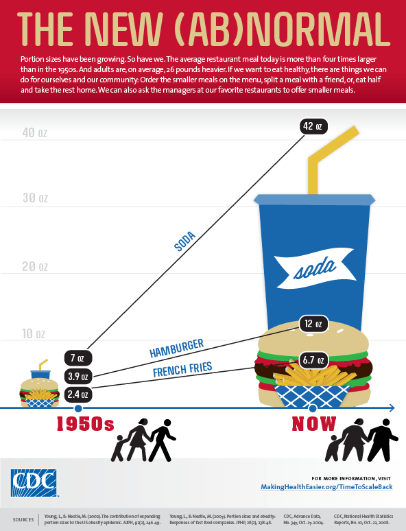
This little infographic from the CDC shows the growth of portion sizes since the 1950s.
 I think the chart is interesting, but I’m not blaming the food industry for making me fat (sorry CDC!). I know there are groups that want to blame fast food restaurants for obesity because of the type of food they serve, but the responsibility for whether I eat healthy or not lies squarely with me.
I used to eat out all the time, picked the most unhealthy things on the menu, cleared my plate and got fat in the process. But the fault lies with me. Not the menu. Not the chef. Just me.
It’s up to us to make wiser health choices, stop mindless eating and get out of the mindset of eating everything on a plate. If you become smarter about food, build good habits while purging the bad ones, what’s on the menu won’t matter.